Reimagining the layout
While At VFS I conducted an analysis and information architecture re design of the popular audiobook app.
Reimagining the layout
While At VFS I conducted an analysis and information architecture re design of the popular audiobook app.
What is Audible?
Audible platform is powered by Amazon.
It’s the largest and most advanced audiobook service in the world. It offers the widest selection of audiobook titles, including the ones published exclusively for the platform.
Who uses it?
People that don’t like to or don’t have the time to read.
Most audiobook listeners engage with their product at home, representing 57% of the total market. Listening to audiobooks in the car is 32% of the total market.

The top three reasons why people enjoy listening to audiobooks are:
- They can do other things while listening.
- Audiobooks are portable and people can
listen wherever they are. - They enjoy being read to.
What do the users say about Audible?
“Good player, horrible everything else (…) Shopping experience is a dumpster fire, they constantly harass you to buy their content”
“The most horrible useless navigation ever designed (…) back arrow takes you back to the home screen every time.”
“I have more than 200 books, (…) I wish the filtering was more intuitive. and navigation easier because I have to go through 2-3 pages just to get back to my library, and when I do it’s not sorted the way I left it!”
The Problem
Current App analysis & Research Insights.
Organizational Systems.


Navigation & Label Systems.

User Pain Points.
The app analysis and the research that was conducted yielded the following as the main points of pain for Audible users.

Poor library browsing experience
(missing sorting options,folders or collections, details and preview)

Complicated navigation
Too many steps to achieve a simple task, unnecessary use of hamburger menu.

Unclear feedback on player
Does not show appropriate progress bar feedback or more information on the current listen.

Bad Shopping experience
Poorly curated categories and aggressive marketing.
Opportunity
After pinpointing the main problems I conducted a series of open and closed card sortings to determine the best approach to reorganize the information.

Key Takeaways.
Open card sort
-
The store’s homepage should be a page that recommends users new books depending on their profile with an algorithm based on previous listens to categorize and organize the titles.
-
A user quiz can be implemented to provide better suggestions.
-
The player should show the book and chapter progress separately.
-
Users can add names and descriptions to bookmarks.
-
The library can be organized by user-created “collections”.
Closed card sort
- The main navigation can be condensed in 4 main groups
(Home, Library, Shop, and Profile). - Users don’t care about the social networks of an app product.
- Amazon originals titles should not be given so much importance.
- Users can add names and descriptions to bookmarks.
- The currently playing book should always be present, it’s the #1 action for users.
Proposed Solution
Information architecture redesign.
The Navigation was synthesized into 4 main sections plus the player.
Site Map

User Flows


Wireframes

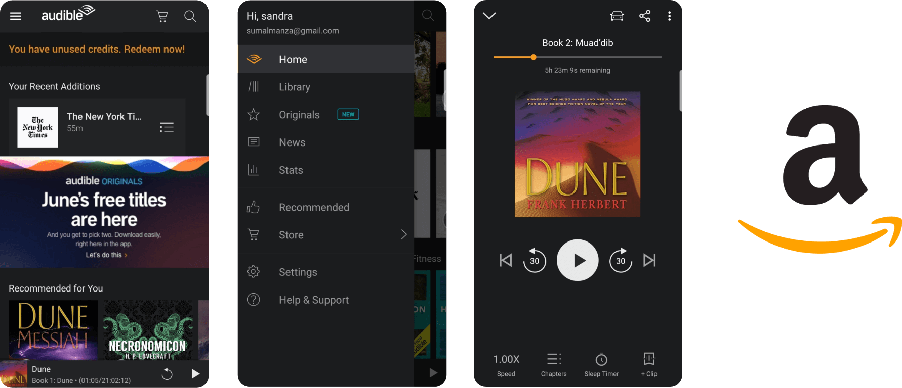
The home page changes to a task oriented organizational system that covers the seeking behaivoirs of the users, first is a list of your current titles to continue listening for users that come with one of their books in mind (know item seeking) after that is a series of suggestions for users that are looking for something new to read (exploratory seeking).


The store’s organizational system remains topical but a secondary navigation was added to ease the browsing process where users can choose different categories for browsing new books, also the cart and wishlist buttons are added on this screen as contextual navigation.
The player’s changes were minimal, it was enhanced with more progress feedback both from the whole book and that specific chapter, the controllers were adapted to provide rewind in different time increments and the action buttons were moved from tab like menu to the top of the screen.

Visual Redesign
The interface was redesigned to fit the new information architecture and to be more aesthetically pleasing.
Light Mode


Dark Mode


Player

Thank You.


