The Future of Presentations
Create seamless multimedia slideshows and add second screen interactivity to enhance your audience’s experience.


Problem
With the constant evolution of technology and our ever-shortening attention spans presenters have to fight harder than ever to grab and keep their audience’s attention.
Goal
The goal was to provide a solution to presenters so that they can engage an audience and assist with the retention of information.
How does it work?

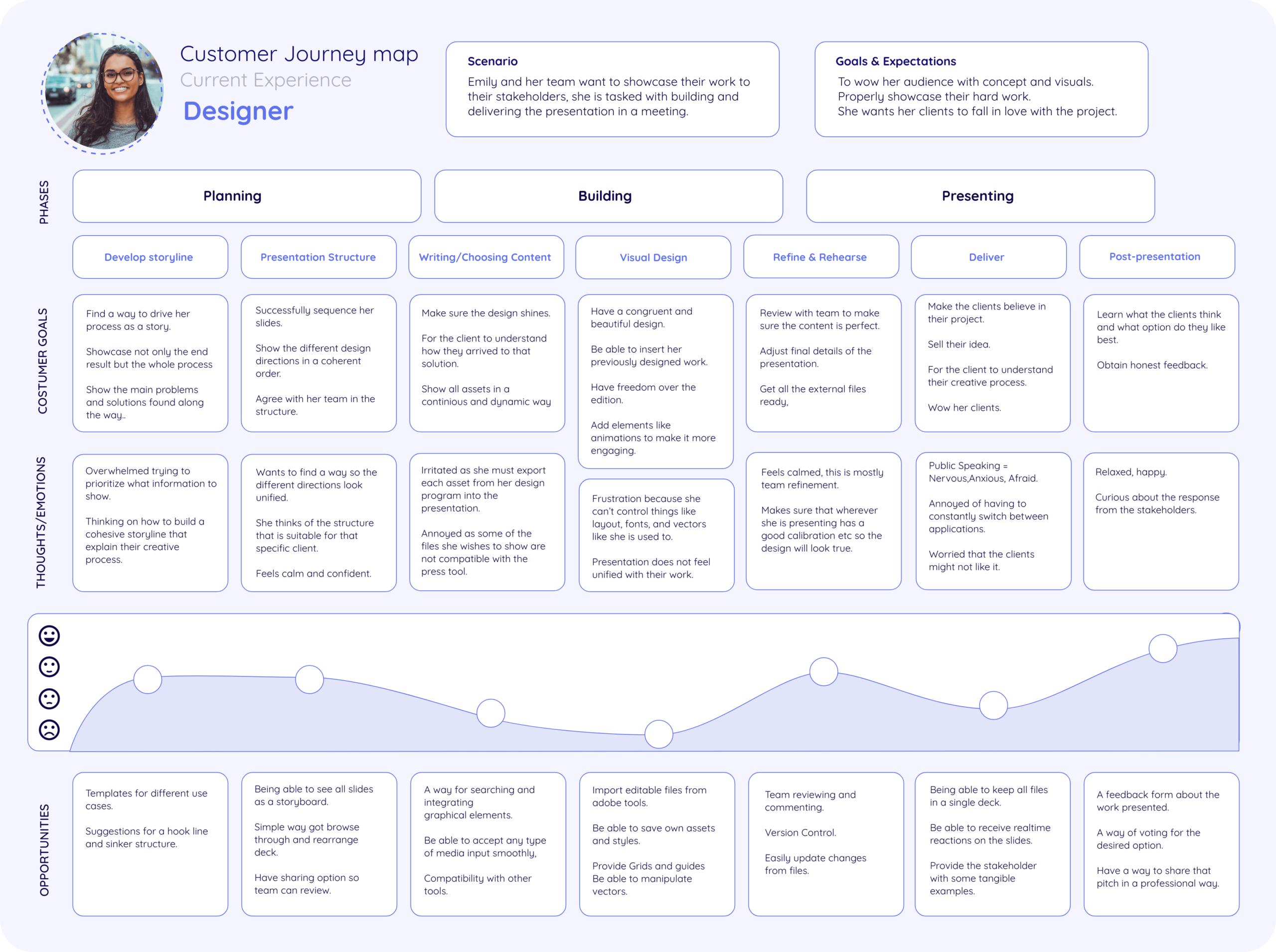
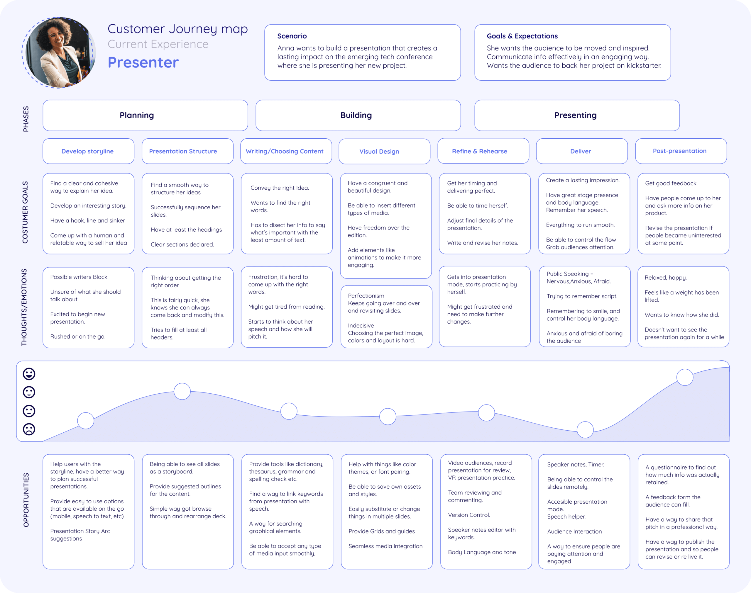
Understanding Presenters
I decided to center my target audience on professionals between the ages of 20-50 that present often for work purposes, I got in touch with some of this professionals and conducted interviews where I learned what is the process they go through, the techniques they use to engage their audiences, the tools and features they currently use and what pain points they encounter.
I built a set of user profiles and distilled these into user archetypes that would allow me to get a much more deeper understandment of their motivations and behaiviours as a user group.

Affinity Diagraming
With all the distilled findings from the interviews and documental research I conducted an affinity diagram to find patterns in the information I obtained from my users, I discovered some key insights like the detailed stages of the process of building a presentation, the most used engagement techniques, this allowed me to build an experience map and specific customer journey maps for each of my archetypes.


Experience Map | Customer Journey Maps | Mental Model
I was able to further dive into the pain stages of the current process of building a presentation, understand the different use cases and individual needs of my archetypes and start brainstorming possible solutions.
I realized that my users have talked about possible ways to improve their experience in the interviews and that some ideas like interactive user content would give my user the control he/she wants in the flow of information and a way to maintain her audience’s attention.
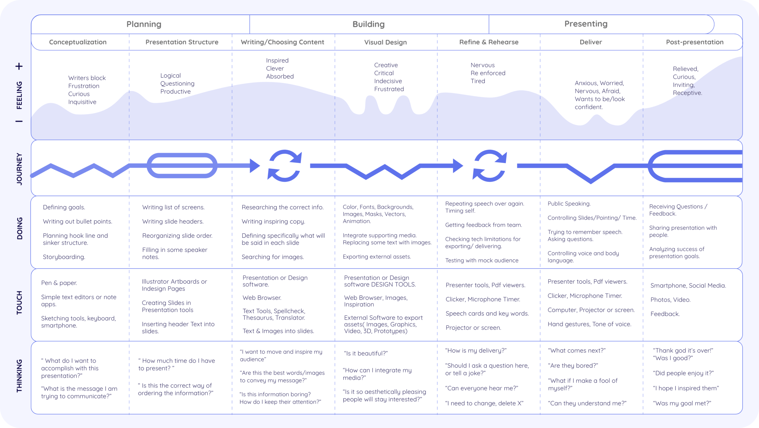


Research: Key Findings


Information Architecture
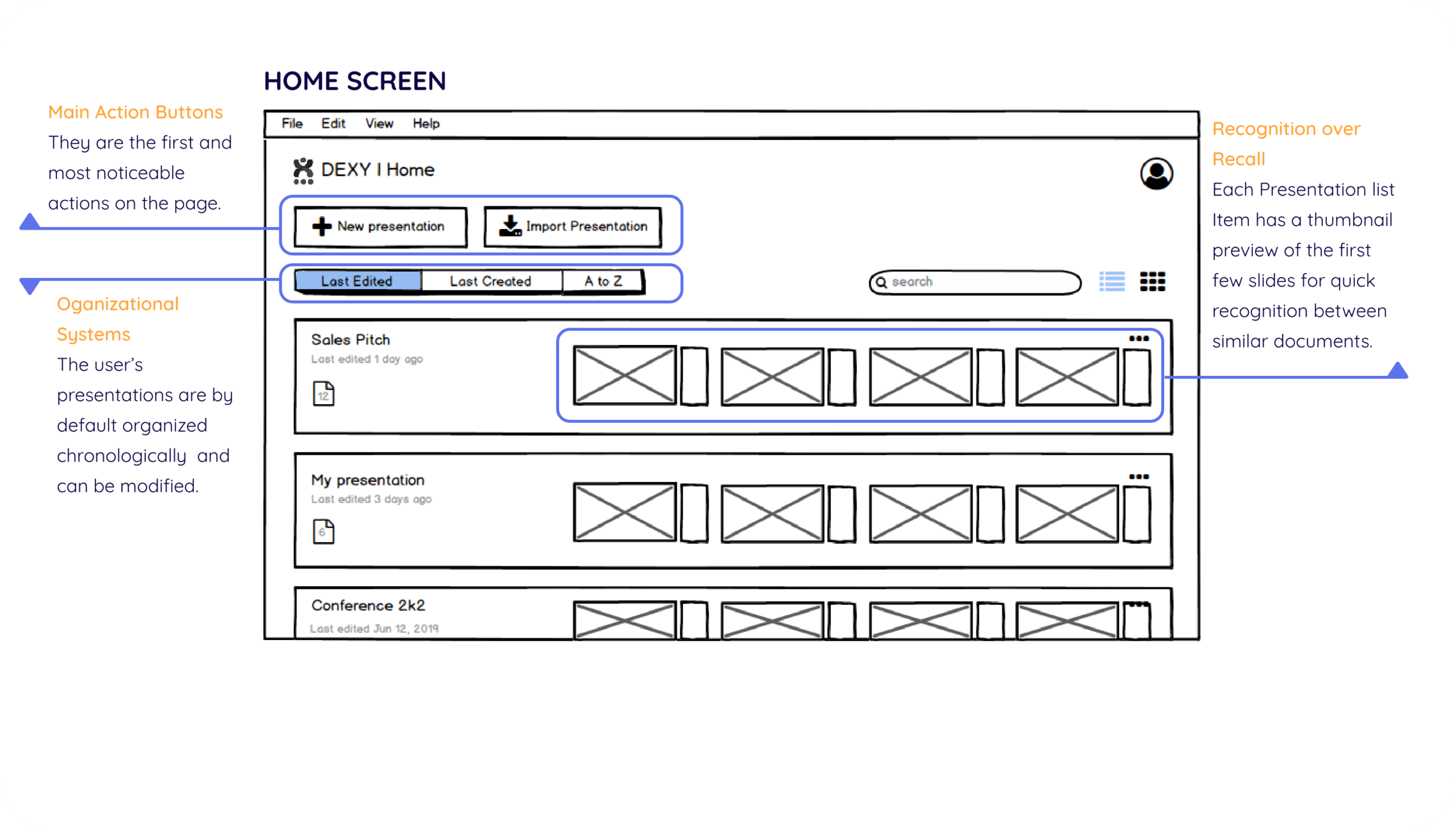
Initial Wireframes
I began sketching some layout ideas for the main screens then developed a set of wireframes in Balsamiq and built a simple clickable prototype to be able to test some of its features.


Visual Design
Logo
I wanted the identity of Dexy to feel modern and serious while staying soft and friendly, this is why I chose rounded shapes, the different color segments represent the seamless integration with multiple programs while the letter X portrays a person on a stage where the three dots underneath signify the audience.
The name Dexy comes from Slidedeck and Delivering Experiences.
Typography

Color Palette
I choose to go with Blue and Orange because they are colors already associated with presentation tools but I used vibrant tones so it feels more youthful and fresh.

Style Guide


User Interface
Online Editing
Dexy lives in the cloud for easy access and synchronization between devices, this also allows for faster sharing and real-time collaboration.
Seamless importing
I realized that my user’s use a wide array of tools for creating presentations, this is why Dexy supports importing from other tools like PowerPoint, Slides, Keynote and even Adobe Illustrator.
You can import entire presentations as well as video, images, and websites as slides by just dragging and dropping.
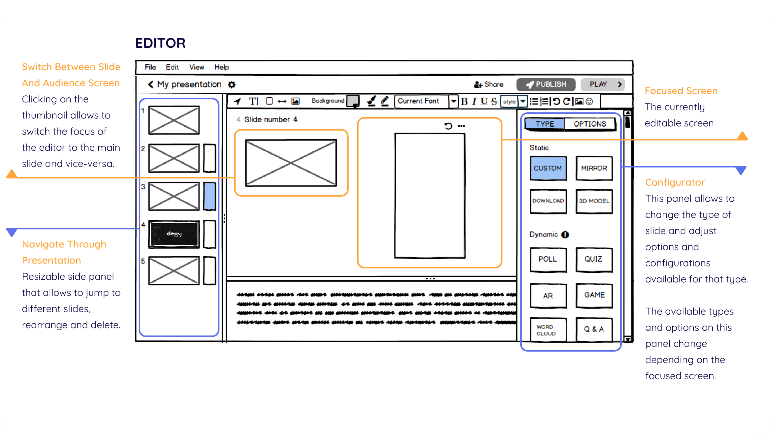
Add or Create Interactivity
Spark up your audience by adding interactive slides like polls, quizzes, games, and even AR integration.
Or simply add a secondary screen to complement the content on your slide deck or provide downloadable assets.
Editor Focus
Switching focus between the main slide or the secondary screen allows for detailed individual customization while still emphasizing the relationship between the two.
Side Panel Control
Change the type of slide, edit the main interactivity content and settings for each specific case.
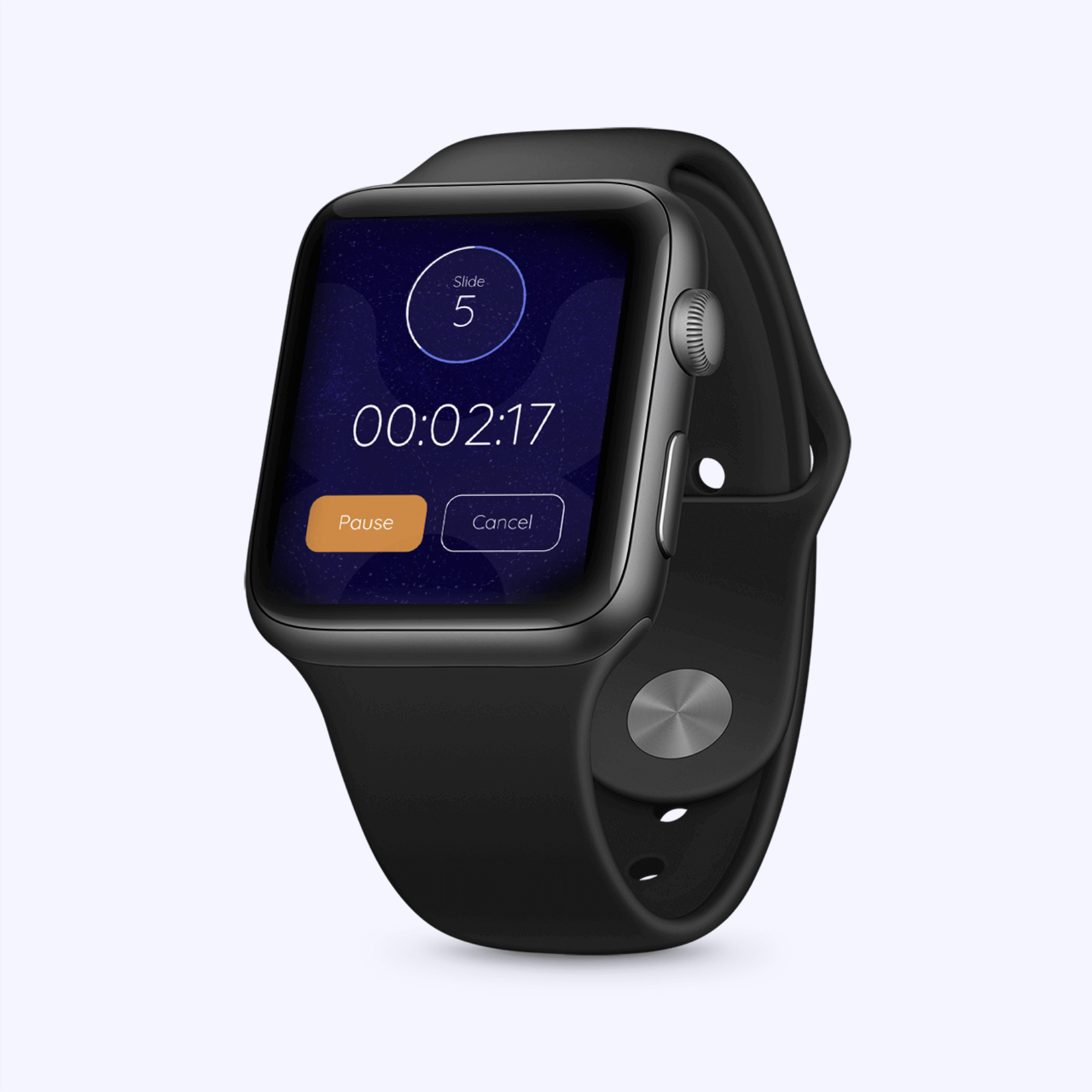
Test your experience
Mobile emulator allows you to test your presentation and it’s interactions as your audience would see it.
Conclusion
This project allowed me to learn new design tools as well as UX methodologies that I will surely be applying in future projects, Overall I am satisfied with the result I believe that because of time constraints I wasn’t able to do as much research as I would’ve liked to, but as design is a revolving process there would be opportunity for constant improvement and iteration over my current screens.
If I did this project again I would definitely be more assertive when defining the project scope, I feel that it was too wide for the given time and this lead to a lot of features and plans that I was not able to develop.


Want to know more?
Message me! and I can show you the full case study.